Get your square!
I want to start out by sending a big thank you to Todd at BuySellAds.com, he saw my post from yesterday and was able to get me on board with their ad service. BuySellAds.com is an advertising marketplace for small to medium sized website owners/publishers. Login to sell space on your blog or to purchase a spot on another site!
So I went through my stats over the last 4 months and averaged to about 14,000 unique page views a day, which is a bit more per day traffic than I had estimated in my last post. Thanks to any of you loyal readers and thanks to any of your Stumblers out there, cause stubleupon.com brings me a lot of great traffic. If you’re a blogger looking to get more eyes on your site – Stumble Upon is your friend, trust me!
Anyway, if you want to get in on that 125 square pixel action over there in my sidebar, go here.
Step 2: Sketches
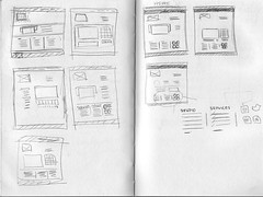
As I said on Niki Brown’s DesignoBlog last month, I need to get back into the practice of sketching ideas before jumping onto the computer! So I grabbed my sketchbook and started with some rough thumbnail drawings to get a feel for what I want to fit on the pages and how they should layout.
This process was very helpful. You’re able to move faster than sketching in Photoshop and the low tech pen and paper mode makes it easy to not get side tracked fancy filters or effects in this early planning stage.
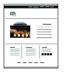
 I scanned in what I think will end up being my homepage layout, and mocked up and wireframe. This shows the Space Gallery being used for displaying new work and a 3 column footer to show information about my studio, services offered and social networks. (for those fun icons!)
Next time on Website Makeover Edition
So… since I’m opening up my process to all of you, I’d be great to get any feedback you have!
Subscribe to this blog to be notified when I post Website Makeover Edition Part Three, where I will be moving into my favorite part, the Photoshopping! :)

Great insight into your re-design… Can’t wait to read part 3 and seeing the final site. Seeing other designer’s thought processes “in motion” is very helpful — it shows how you think, not just design. Good stuff!