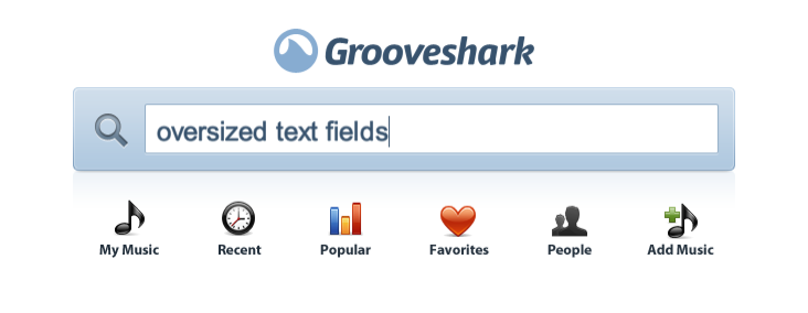
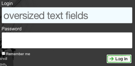
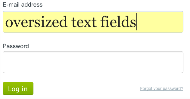
I’m sure you’ve noticed the trend too, text fields just seem to be gettign bigger and bigger! I gathered up some slightly large, pretty large and the straight out HUGE login, search, and form fields from the web. If you know of one I didn’t include, leave a comment and let me know about it!
Most of these are so big that the screen shot is too wide to fit in my blogs entry area, so you’ll have to click on the image to see the pages text field at actual size.


I enjoyed this post. It’s definitely a trend that I enjoy right now. Forms have really shaped up over the past few years.
Thanks!
We put different type of Text Field in web design.
Here this blog is really good and informative.
Look at google ..
Yes! The Google search bar got a size bump on Wednesday this week!
I love the trend of big and simple that seems to have taken over forms these days! Definitely keeping the user in mind!