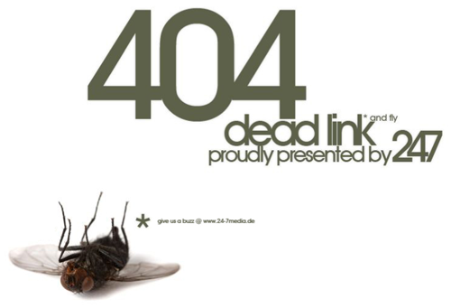
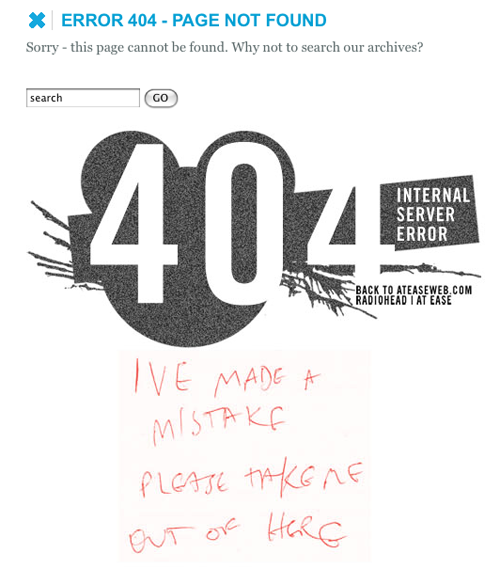
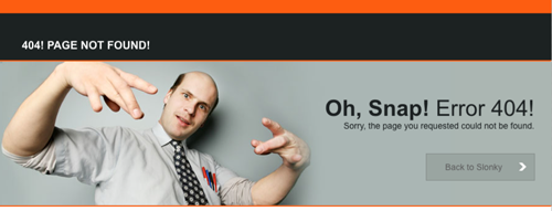
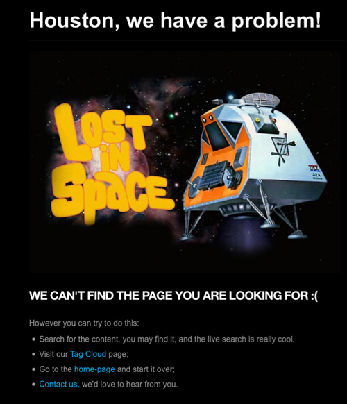
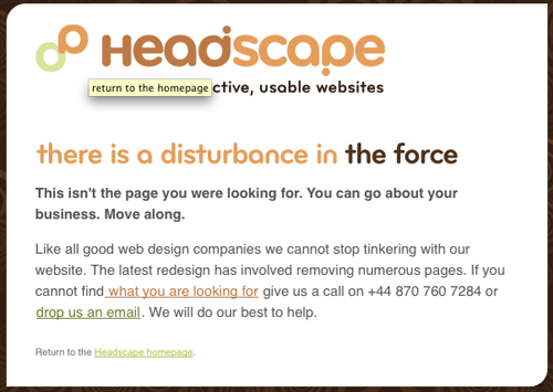
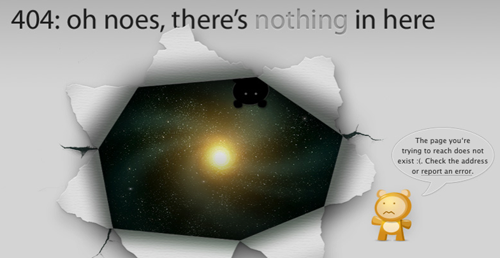
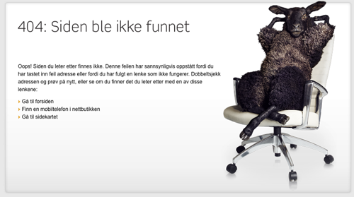
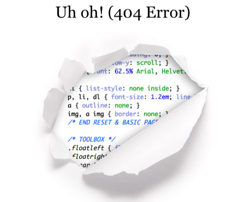
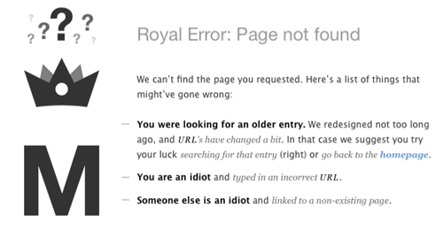
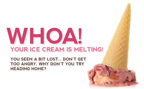
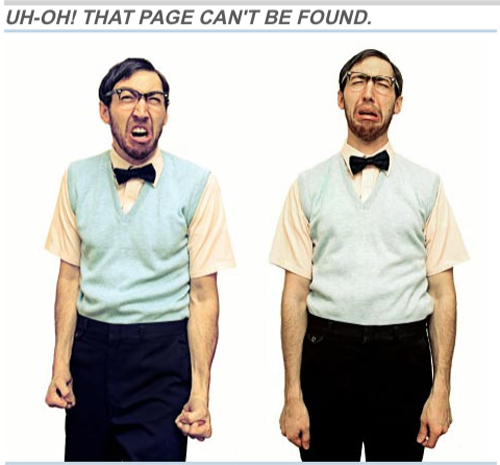
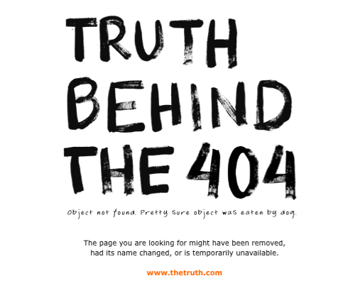
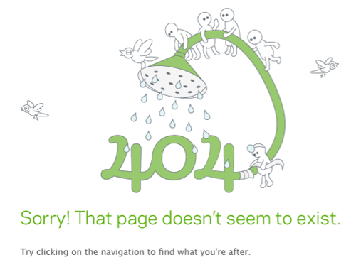
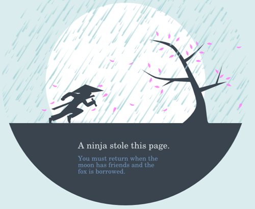
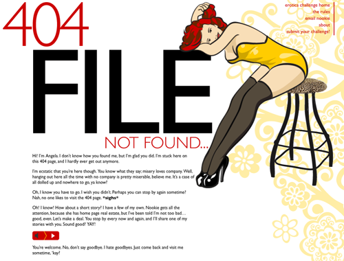
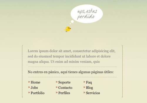
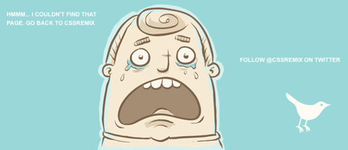
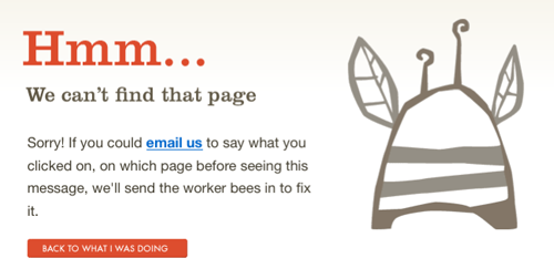
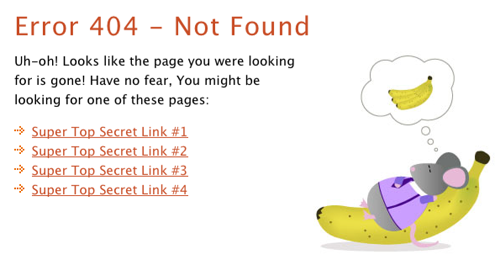
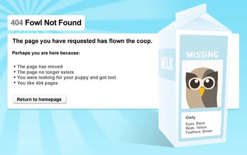
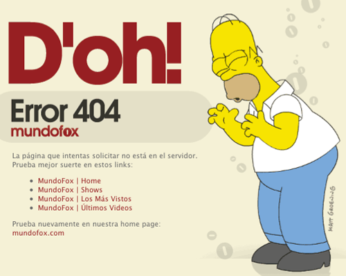
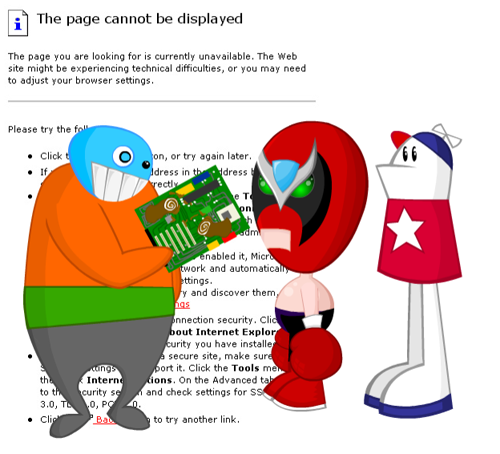
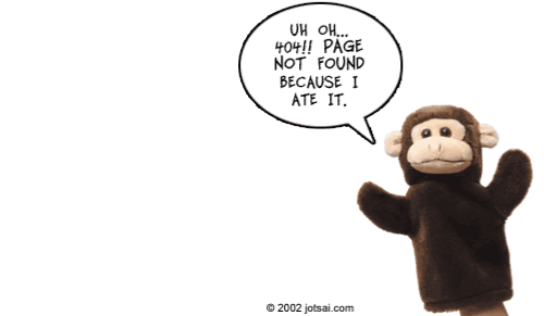
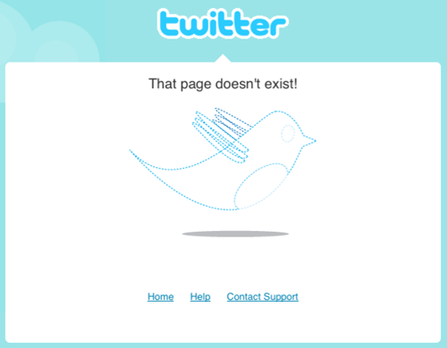
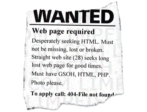
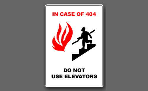
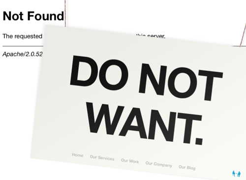
So, I recently was thinking about 404’s for some client projects and ended up doing a lot of exploring through the internet to see what others are doing. Error pages are something that is just annoying, but some of these websites designers have come up with ways to make the 404 a little less of an eyesore. Whether its with some beautiful typography, illustration, animation or even just some clever copy writing, these 404 Error pages put a creative twist on error pages.
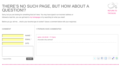
This first one is from a recently completed project for Seattle photographer, Laura Marchbanks. She’s just started a blog and we wanted to incorporate her fresh and quirky personality into the design. Part of this ended up including making the 404 Error page more of a random interaction with Laura instead of JUST an apology message. Added comments and a fun question for her wayward visitors.





These are great! Thanks for posting. I’m going to have to create some 404 pages now. It seems to be fun!
Sweeeeeeeeet. who knew?
You should check out http://fab404.com it has awesome 404 pages!
This site rocks!
very nice list , coming up with a usable 404 page is more impotent but adding something funny as all ways a nice for a designer to express them self. I usual just redirect to the home page on smaller sites.