I was recently a part of an article at VelvetAnt.net called Ghosts of design work past, where 18 designers shared some of our student work from back in the day. Luckily, it looks like everyone had doe a tremendous amount of growth since these pieces!
It was difficult to even find my old stuff — this is all from back in the days when owning an external hard drive wasn’t dirt cheap and many of these things were originally backed up on ZIP drives (do you remember those!?) Plus, much of my layouts were composed in Quark, which I do not even have a copy of anymore!
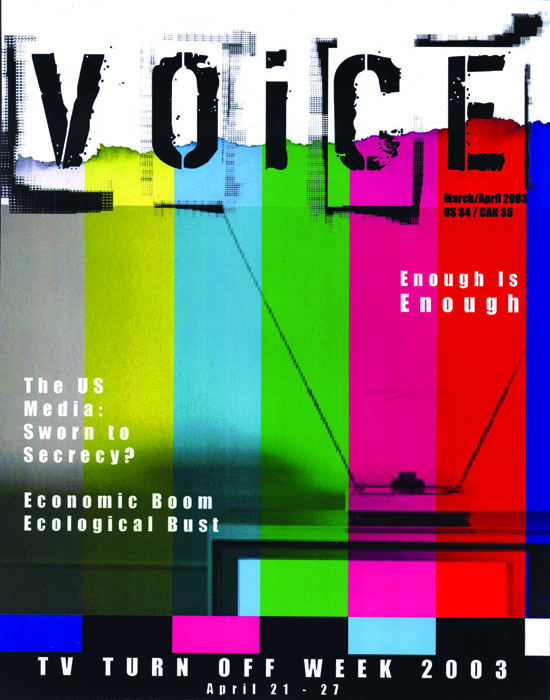
Antonea chose to feature in her article a magazine cover design I did Freshman year.
There just seems to be no regard to typography or grid on this, the only thing I actually like is the image concept – but that’s about it. – This is me talking about this horrific piece of “design”
Magazine Cover, Freshman Year
After putting one piece of design past out there, I figure I might as well open myself to even more embarrassment! :) So here you go people… design skeletons from my closet. You can see some of my more recent (and less gag inducing) work here.
Poster, Junior/Senior Year
Poster design to promote vericomposting. The typography on this is appalling, I know the “grunge” thing was in fashion – but some of this just seems sloppy to me now. Also – the assignment was that you were creating design work for King County Waste Management and this DOES NOT look like anything a County office would ever go for!

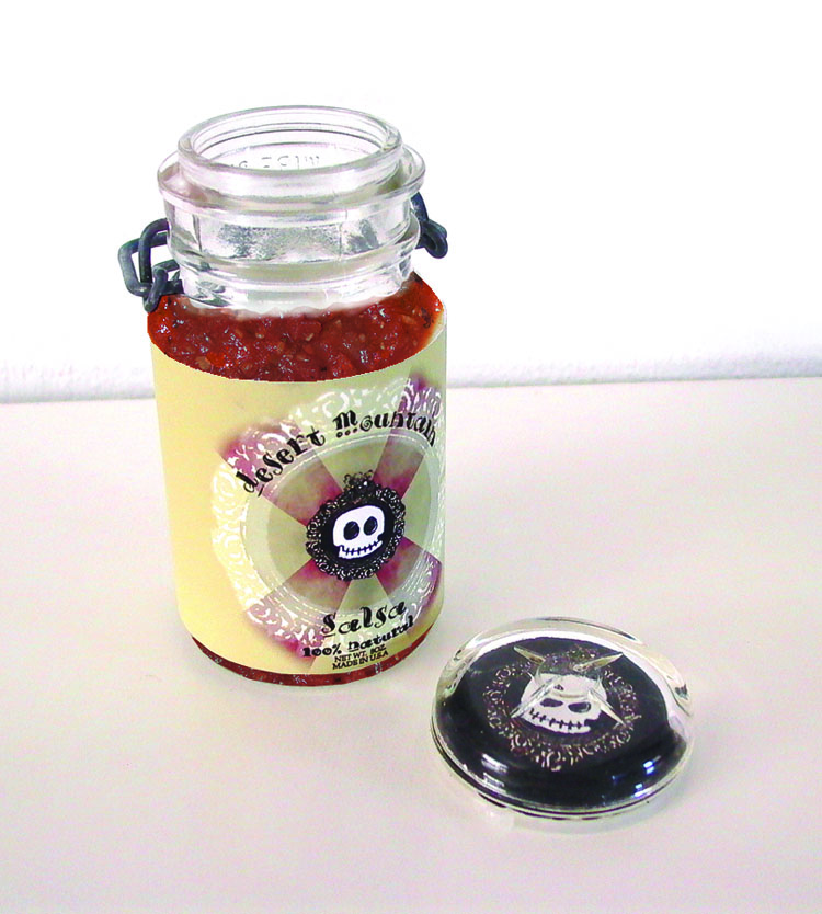
Packaging & Print Advertisment, Senior Year
Logo/Branding/Print Marketing for fictitious salsa makers, Desert Mountain Salsa. This project included everything from Black and White Newspaper ads to coupons. Here is the package label and a magazine ad. The typography on the logo horrifies me and also the shotty Photoshop job I did on putting salsa in the jar – why didnt i just PUT salsa in the JAR!? I dont know! My favorite parts of these are the puppet I used in the ad (made my my roommate) and the slogan I came up with for a Salsa sold out of Seattle. “A Taste of the Southwest in the Northwest.”

CD Packaging, Senior Year
CD Packaging for fictitious band, The Nothing. (I guess I don’t have a lot to say about this one) Those were my roomates who posed as the band!


So amazing! Haha. It is definitely a funny bit of information to share. My favorite part about my old work is that I strategically placed everything into a folder labeled ‘good work.’ I think I must have been planning on using the work in it for my professional portfolio. It is really good that none of those pieces made it to my portfolio!
Thanks for sharing! I really am enjoying seeing everyones old work!
Man…im totally going to have to get in line and make a post like this! My school projects were….interesting to say the least :) Lots of monsters, mustaches and…strange stuff.