Sometimes there are things I think about or talk about with friends and I want to write about them on the blog, but I get tied up with polishing them and packaging them into a larger idea. I’ve decided I’d get more actual content out and up if I stop this and just throw out my random 2cents on stuff every once in a while!
So you know what phrase I can’t stand hearing people use when talking about web? “above the fold,” anyone else with me on this one?

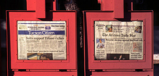
“Above the fold” is a graphic design term that refers to the location of important items on the upper half of the front page of a newspaper or any other type of printed thing that folds.
So then what does this mean in web? My screen doesn’t fold. This terms when used in regards to web design is usually referring to the information that shows within the browser window on an initial page load (before anything is clicked, hovered or scrolled.)
Now, don’t get me wrong… i definitely believe that placement of elements in this area is really important, however — it s NOT necessary for EVERYTHING to fit in this space or for the whole site to have a fixed height!
Give your users a little bit of credit. Anyone using the internet understands that web pages are meant to be interactive and has mastered the use of their scroll bar. Thinking that you user will not able to access information that isn’t in the top 500 pixels of your screen is the equivalent to believing that no one will be able to find a magazine article that isn’t printed on the cover. It comes from some tiny part in your head that believes your audience are brain-dead apes, and they aren’t!
This is just my 2cents …feel free to share yours!
google_ad_client = “pub-9085994600988691”;
google_ad_slot = “6723419069”;
google_ad_width = 468;
google_ad_height = 15;
Hehe…I completely agree! While important, the “above-the-fold” push is one of the most overrated priorities in web design. And unfortunately it’s one of those things that tend to be gripped tightly by consultants or clients who know little about some of the more important aspects, so they fight you to the death about it, even to the detriment of a quality layout. Thanks for expressing what is probably a common frustration for web designers.
I agree. Of course there are some elements that will benefit from being above the browser-defined ‘fold’. If you’re designing a landing page with a call to action, the click point for your customer to initiate that action would definitely benefit from being visible without having to scroll. (And, ideally, appear again lower down). But a design can be ruined by adhering to a misguided notion that people are scared of scrolling down a page and consequently cramming evrything up at the top.
The idea of “if you build it they will come” died a long time ago, as a million SEO companies will testify. But maybe there’s another, similar idea that is not so dead:
“If it’s worth their while, they will scroll”.
@Rick Lecoat
SOLID GOLD! love it, “If it’s worth their while, they will scroll” :)
thanks for the comments guys! :)
I cringe when i hear the terms “above the fold”, and “pop”… yes they had relevance at one time, but in a time where monitors are getting larger, and we are creating secondary pages to served up for mobile content… the fold just isn’t that relevant anymore…
if people are interested they will scroll down the page for more information.. rick said it correctly “If it’s worth their while, they will scroll”
~ Aaron I
You already got some great responses…
Smashing Magazine had this to say about scrolling a few days ago.
“Jakob Nielsen’s study on how much users scroll (in Prioritizing Web Usability) revealed that only 23% of visitors scroll on their first visit to a website.”
Article: http://www.smashingmagazine.com/2009/09/24/10-useful-usability-findings-and-guidelines/
Under the headline, “Most Users Do Not Scroll.”
Everything in web design is case-by-case. If your target audience is that 23% then go nuts. However, if you’re making a site that targets home owners that need a contractor, you should keep it “above the fold.”
Cheers,
LukeG.
Luke, you *do* have to think about your audience, of course. Audience determines so much when it comes to web work. Thanks for referencing that Smashing article, i think they put it well with:
“This doesn’t mean you should cram everything in the upper area of the page, just that you should make the best use of that area. Crowding it with content will just make the content inaccessible; when the user sees too much information, they don’t know where to begin looking.”
As i said, that initial load of any webpage is very important, and key calls to action should be laid out where they are easily found on first visit, but our job as designers is helping our clients define what those *key* items are and not just trying to fit ALL content up top.
LOL @Aaron, what would you say to “let’s move everything above-the-fold, that way it will really ‘pop!'”
Agreed. And certainly getting the proper content to the users eyes is important in any situation. There are many ways to capture one’s attention and bring it down the page.
Here’s a site that uses scrolling to it’s creative advantage.
Bryan Katzel’s http://webleeddesign.com/
Cheers,
LukeG.
In smashingmags recent usability article they reference Nielson findings that only about 23% of users will scroll the first time they come to a site. That seems like it be pretty damn important to make sure that whatever is above the fold makes an impact. http://www.smashingmagazine.com/2009/09/24/10-useful-usability-findings-and-guidelines/
Just keep things brief and organized. If your readers have a sweet tooth and you lay out some candy on your pages, they’re bound to take a bite. :)