Before & After
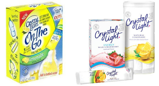
I noticed this about 3 weeks ago on a trip through the grocery store and it caught my eye. Crystal Light has updated their packaging and I give it a thumbs up! What do you think?
I noticed this about 3 weeks ago on a trip through the grocery store and it caught my eye. Crystal Light has updated their packaging and I give it a thumbs up! What do you think?
Comments are closed.
For me the new package yells clean and refreshing. I am a fan of white space on most things artistic and visual. The old package might have made sense as we were all looking to move from buying bulky water in the product or just buying water bottles. So they needed to have the pictures and information on how to use it.
As more of us got acquainted with this evolution of product, i’m thinking it’s easy to downscale the loud package and just look reserved and proper.
BTW i do the same thing, always comparing new and old packages. I find i still miss the old doritos red and white bag lol.
I like it! Very clean, hip new look. Logo seems nicely updated to a more modern look and feel. Looking at the old box now it seems more like a cleaning produc, very busy. Too much emphasis on yellow being it’s “lemonade” and all. Overall new look is clean and easy to read.
Much cleaner and fresher, I think it’s a real improvement.
I dig it!!
I felt that the previous packaging design was very dated and busy.
This new design is very modern and “in” with the simple and healthy trend going on.
Definitely a thumbs up. Somehow the new design keeps the essentials of the brand with just enough of a face-lift. Do you remember the Tropicana fiasco? not related I know, but just popped up in my mind.
thanks for sharing your thoughts everyone! I am drawn to this sparse clean look. Especially for this product where you want that “light” feeling. It is pretty amazing how they managed to keep all the essential into on there but still keep such nice white space!
Very minimal in terms of elements used, and very colorful as for the colors it does have. Type works wonderfully well with it too, I really like that after packaging Liz. ;) Clean, just as stated before.
The clean new look really captures the brand’s name. It does deviate from its previous informative picture, however by abandoning that and going for a fresh, crisp look the product looks infinitely more attractive and something that will sell better.
From a design perspective this might work, but these new packets are terrible to use. Takes much more time and effort to make a gallon at a time than the old tubs did… This blows…